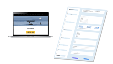

MaryShot
a photographer website
Project Overview
The photographer offers three services in California: portrait, e-commerce, and newborn photography.
Sessions take place outdoors, and clients can choose their location.
And needs a Website to increase the number of people to book the photographer
The photographer found clients through Instagram and Facebook.
Building trust was a challenge for potential clients.
Clients had to call for details about packages, prices, and availability.
This process is time-consuming for the photographer.
Challenges
Leadership Priorities
The stakeholder preferred that customers only contact her for counseling, so we needed to ensure every detail was clear and concise.
Stakeholder requested a website design that balances elegance with simplicity to effectively showcase pictures.


Process
Our team used a Double-diamond design process based on Design Thinking, with iteration between stages as the project progressed.
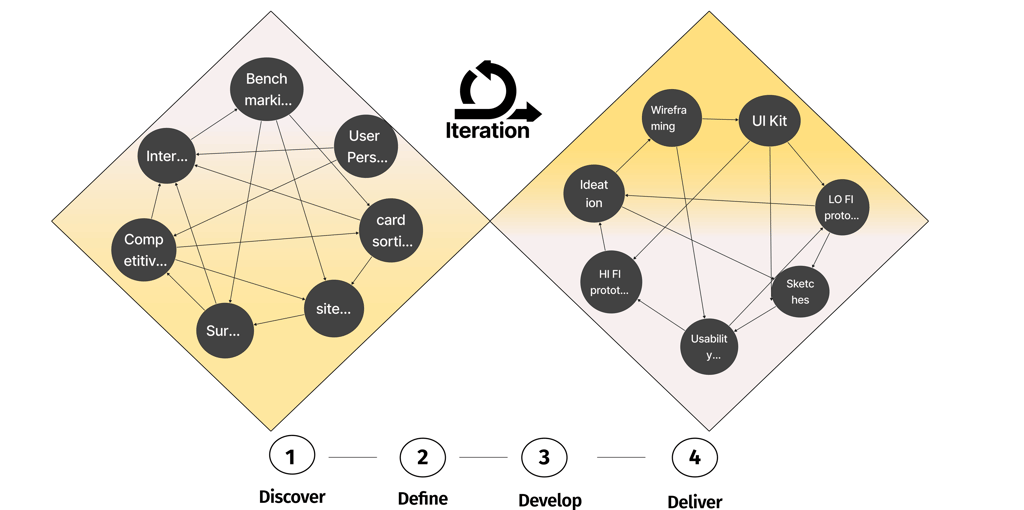
Discover
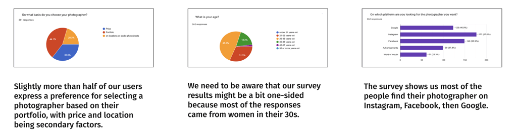
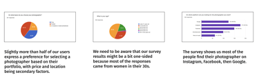
The aim was to understand our audience and their needs for Building Empathy. We gathered insights from 266 participants through surveys on Facebook, Nextdoor, and Reddit.
Survey insights: 👇🏼
To answer the larger questions about how the customers explained their experiences, feelings, and opinions (In-Depth Understanding) regarding using other photography platforms.
When you visit a photography website, what do you want to see first?
How do you feel about contacting the photographer to ask for the price? Why?
What features do you like? Dislikes? Why?
What information might have been missing while hiring the photographer?
Have you ever had any issues when using a photography website? If yes, What were they?

Survey
What we learned 👇🏼
They want to see the photographer's portfolio or gallery.
Finding the packages and prices is difficult.
They prefer to see the categories/services provided at first glance.
They need to know the photographer’s personality and appearance.
The location of places outside of the studio, if it’s convenient for them or not.
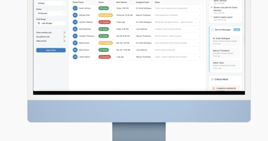
To design our self-booking feature, we analyzed a competitor's website, headshotsbykemp.com, that offered similar functionality with 3 potential users.
Our goals:
To understand user interactions and identify strengths and weaknesses.
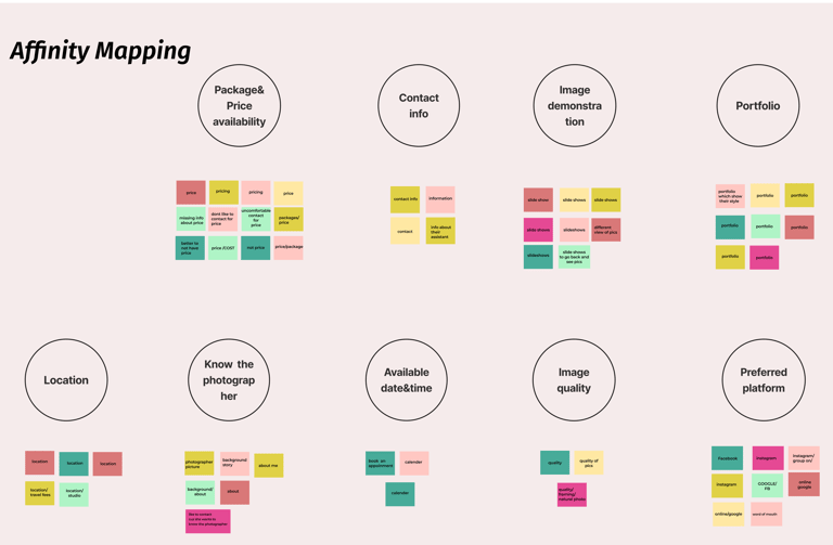
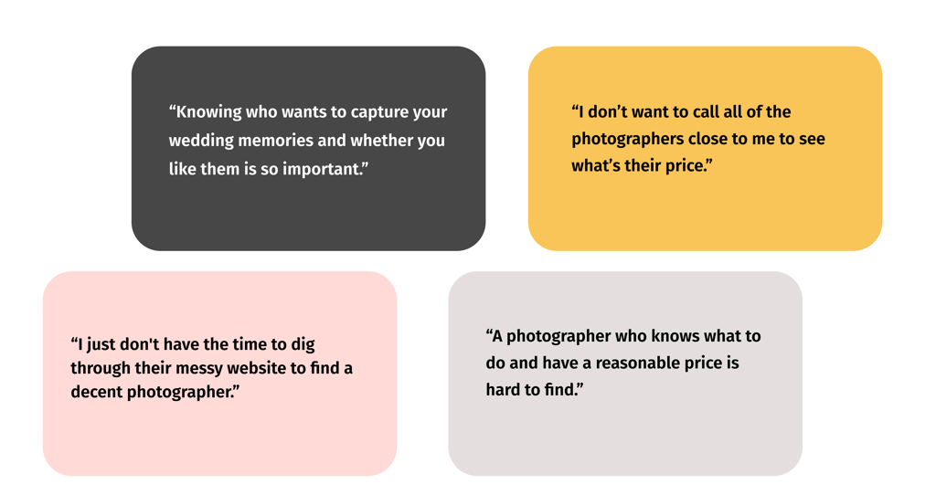
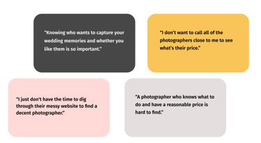
Interview + Affinity Mapping
Benchmarking Competitor Experiences
My first step to solving the problems was researching:


Overall, the booking experience had room for improvement
Key Findings:
Important package details were hard to find, frustrating users
Customers liked comparing package options and pricing quickly

User Stories
Specific needs and expectations of target users when visiting a photography website.
Develop an effective information architecture that organizes content in a logical manner.
Define

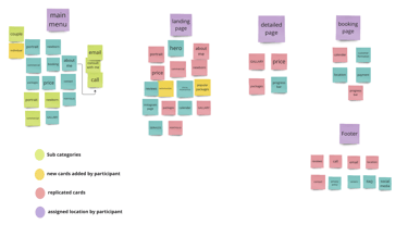
Card Sorting
To improve website navigation and organization, we conducted 5 remote card sorting sessions with potential users and stakeholder to identify effective labels and understand how users expect to find photographic content.
👇🏼Here's one of the sessions as a sample.
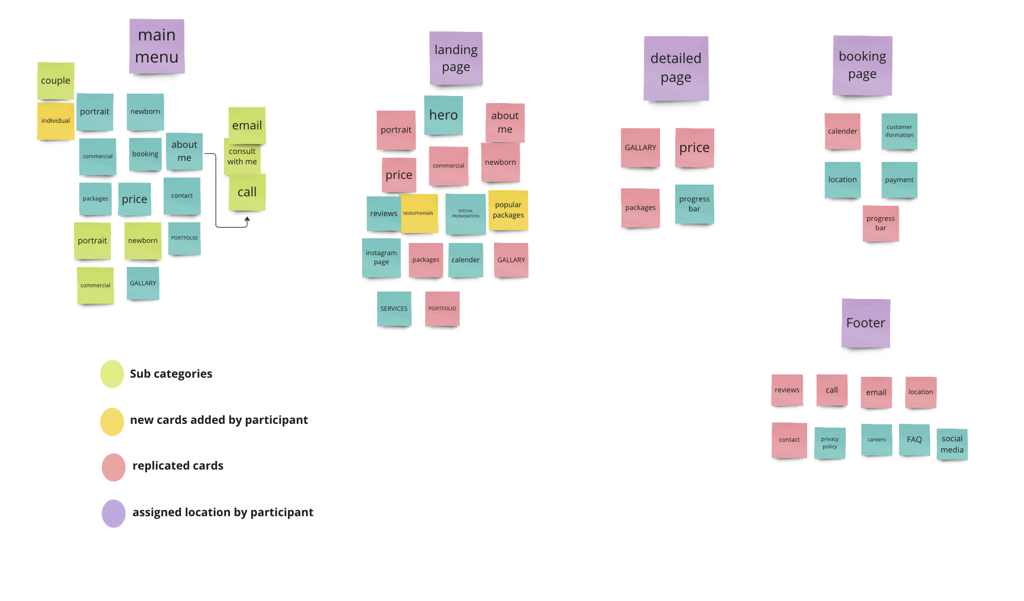
Site Map
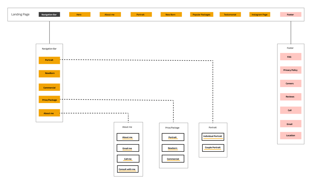
The results from our analysis of the card sorting activity led to the design of the information architecture and site map.
Develop

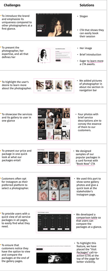
Challenges and solutions
After our research analysis, we identified our product's challenges and sought solutions ways to solve them in our design.

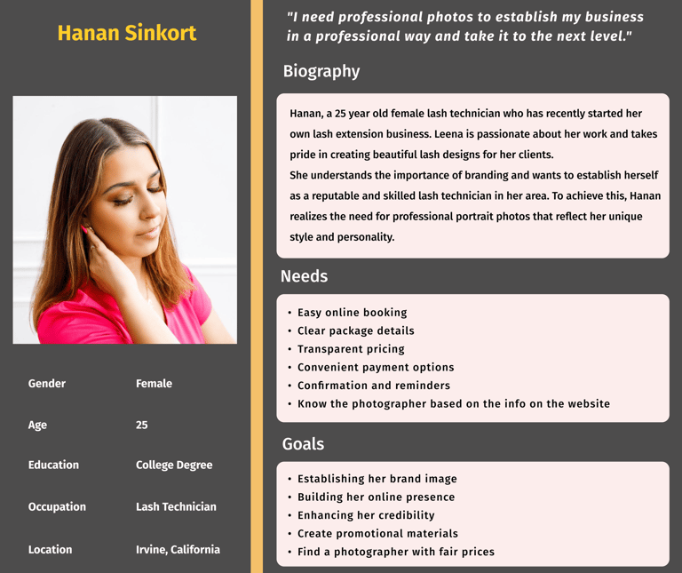
To create tasks for our design and share user information from our research, we developed a persona and a storyboard.

Persona and Storyboard
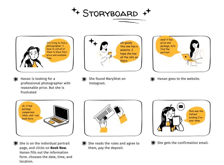
Task flow
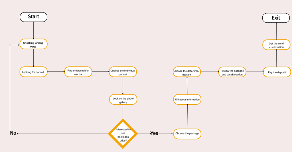
Design
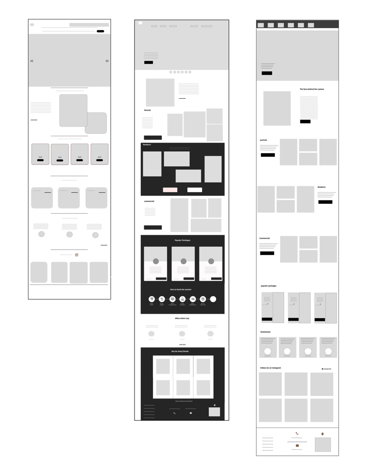
We started our design process by hand-sketching low-fidelity wireframes. This helped us clarify our ideas and improved communication within the team during the early design stages.
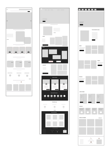
Next, we created low-fidelity wireframes in Figma to outline page layouts and our design vision. We changed these wireframes several times before finalizing the content.
Sketches
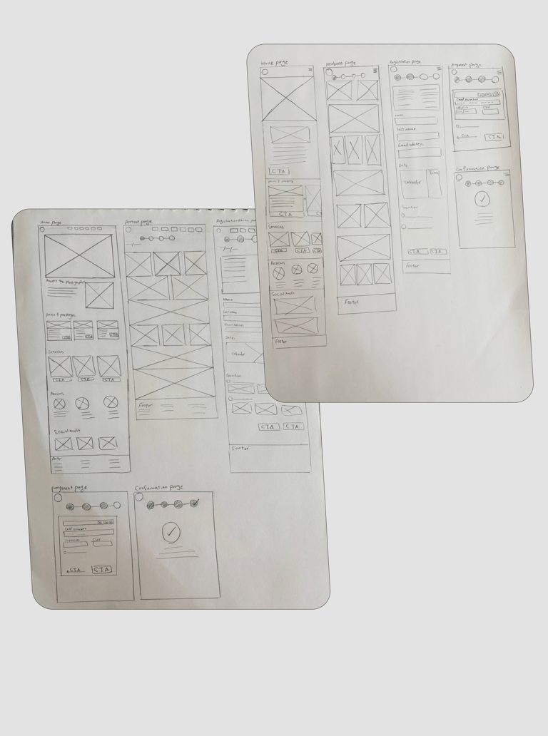
Sketch
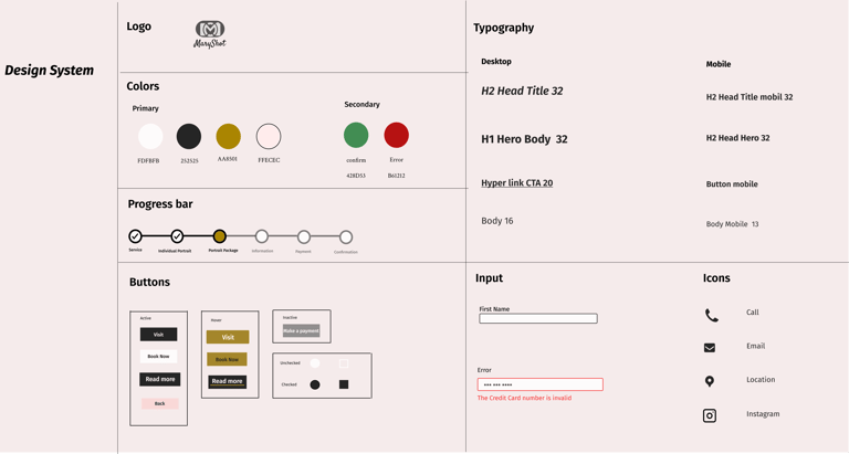
UI Kit
We create guidelines for color, font, and size on all screens. This helps users navigate a consistent design system easily.
Mood Board
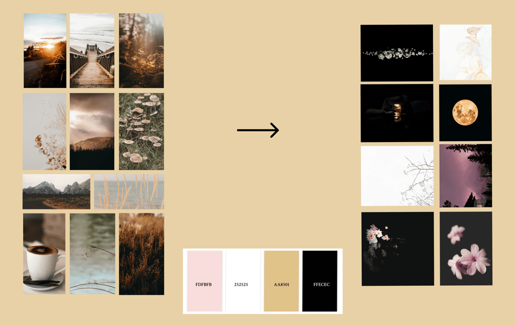
First, we considered warm, earthy tones but transitioned to a clean black and white base that spotlights the artwork itself, accenting with golden yellow tones for sophistication and soft pink for vibrant contrast
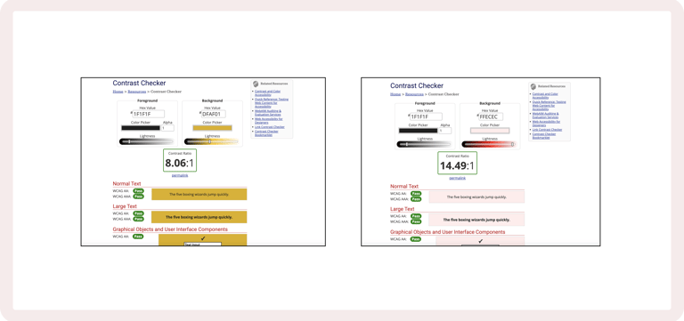
Color Accessibility
We checked the contrast between the button colors (foreground and background) on our primary and secondary buttons to make sure they are suitable for people with color blindness. We also confirmed that they meet all accessibility standards.
Testing
Usability& Iteration
Phase one
Version 2
Version 3
Home Page Mid-Fidelity Iteration
Using our ideation process, we created three different home pages, and after testing and iterating, we chose Version 3, Phase One.
In version 1, we included a slideshow at the top of the page to showcase the photographer's portfolio. We hoped to create the feeling of flipping through a photo album while the rest highlighted available packages. However, users ignored the slideshow.
In version 2, we added small icons of sample photos below it, but engagement remained low, with users showing more interest in the portfolio when paired with call-to-action (CTA) prompts.
In version 3, we removed the slideshow and instead displayed the portfolio with CTAs and descriptions throughout the page to encourage users to explore the packages.
Portrait Page Mid-Fidelity Iteration
After multiple versions of sketches, we made 2 versions of the Mid-FI of Portrait Page and performed A/B testing.
B
A
Version 1
Phase Two
Phase Three
We tested our prototype on a total of 18 people.
We gave our participants 4 tasks.
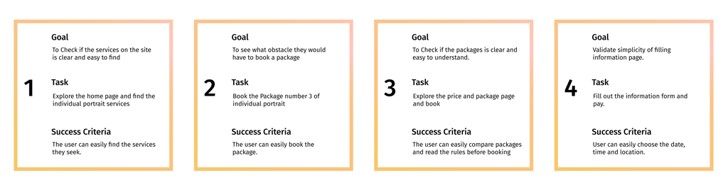
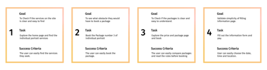
Testing Task
First Task Result
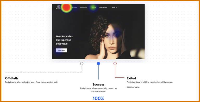
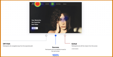
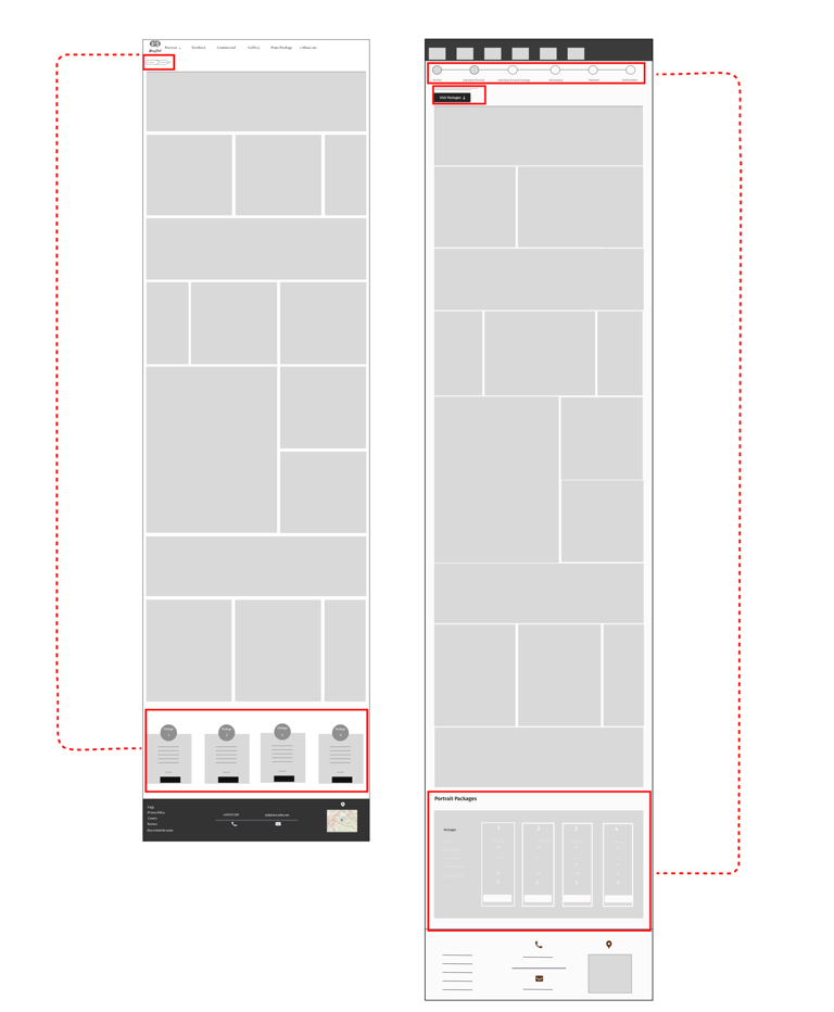
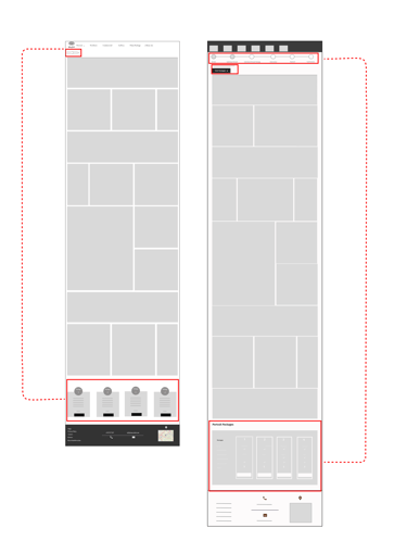
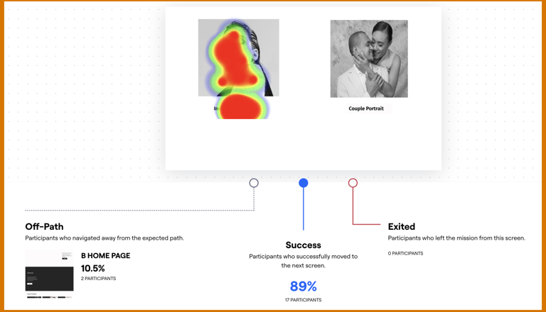
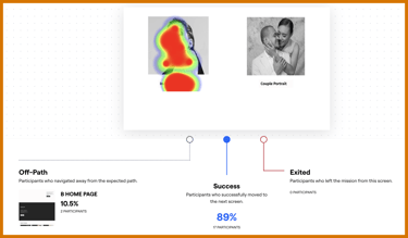
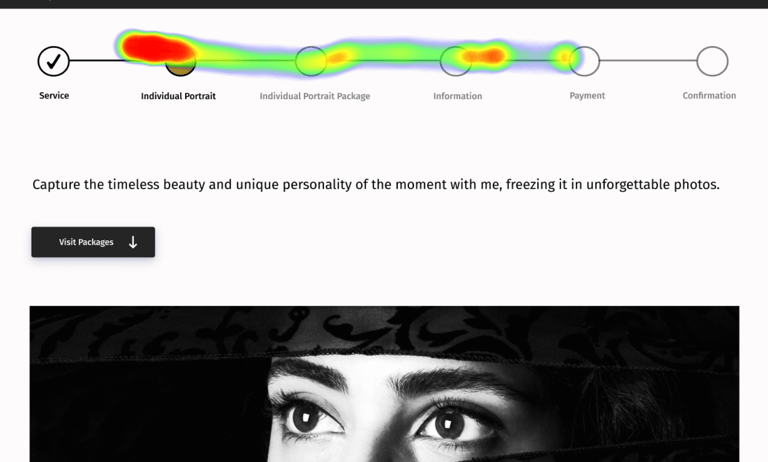
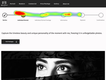
When we asked them to navigate the homepage and find the service, the heatmap indicated that they located the services but preferred using the navigation bar.
We found that our website’s navigation bar helps users quickly find information about our three services, complete with packages and prices. This information is also clearly displayed on the homepage for their.
Findings
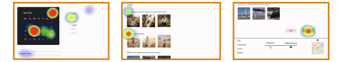
Second and Third Task Result
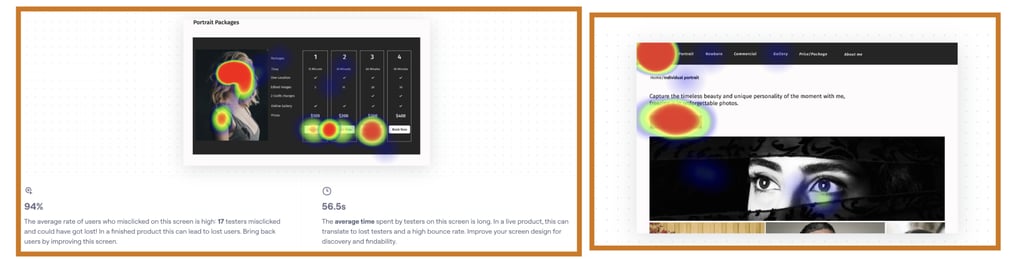
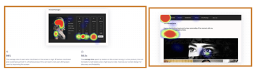
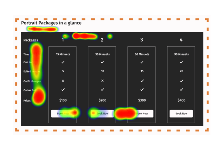
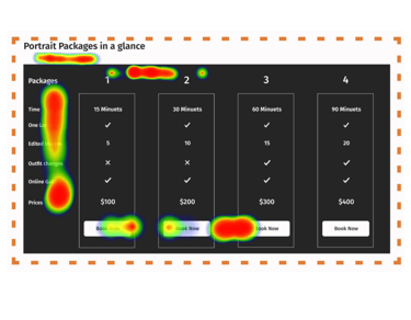
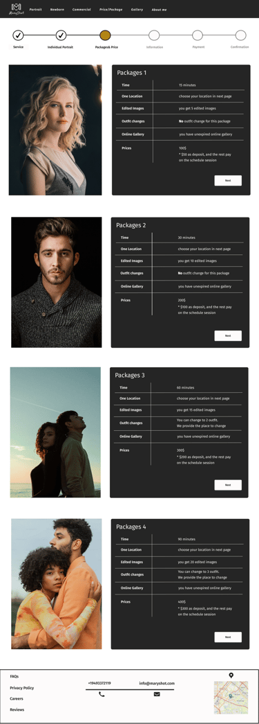
We added a progress bar to replace the breadcrumbs because users didn't notice it. In the second obstacle, we removed the image of the comparison table because it confused users, and they mostly focused on the picture. This change helped users see the expanded table more clearly.
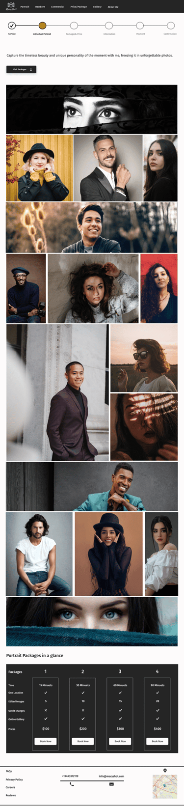
Individual Portrait
Before Usability
After Usability
Forth Task Result
In the fourth task, users were very happy with the form's design and layout. They found it easy to understand and navigate, which helped them complete it quickly and efficiently.
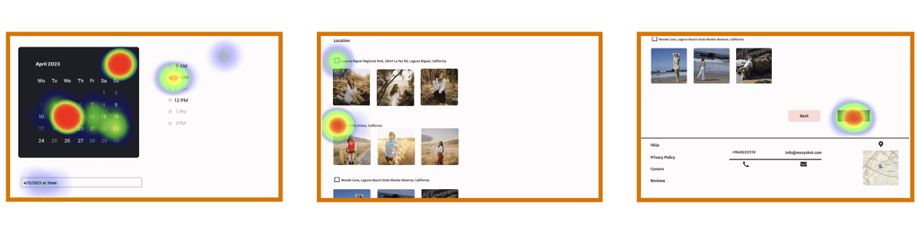
Available Date&Time
Location
Book CTA
In the second task to find and book package number 3, users successfully clicked on the visit packages CTA. However, the comparison table revealed confusion, leading to a high misclick rate.
Explore and Book Package Number 3
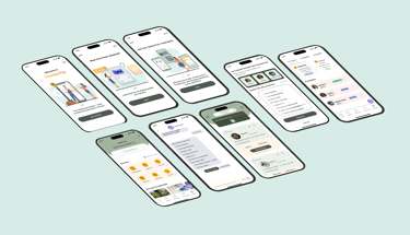
Deliver


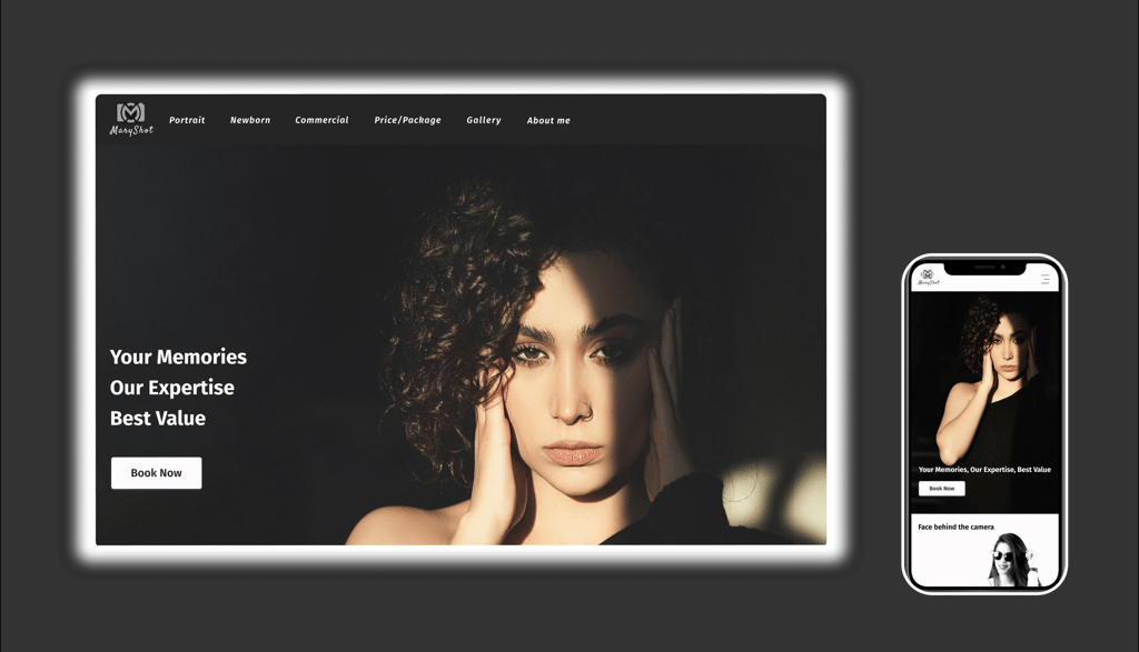
High-Fi Desktop Mockup
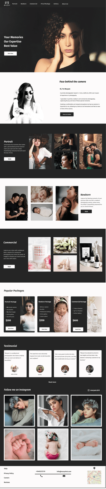
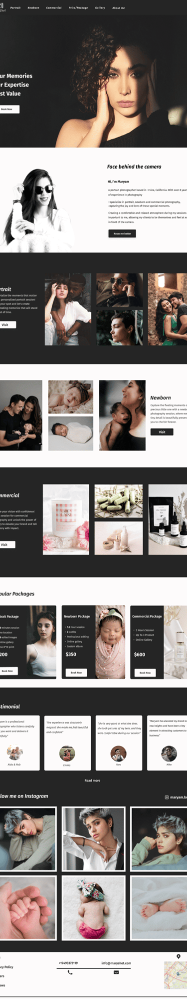
Landing Page
Individual Portrait Page
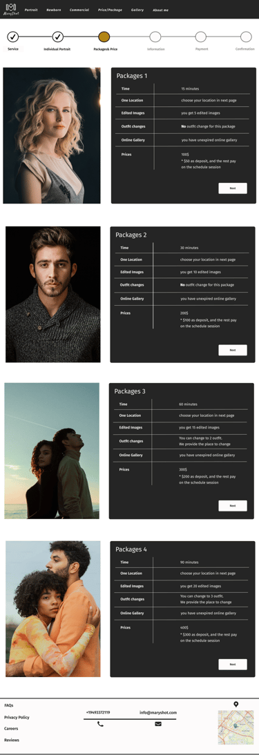
Portrait Package and Price Page
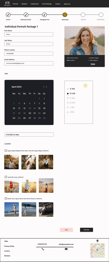
Information, Available Dates and Location Page
Reflection
I had never been involved in an art project before this. I learned to be flexible and listen to stakeholders and other professionals to adjust my ideas for better results.
As a UX researcher and UI designer for this project, I had to be open to changing the design based on user feedback, even if it meant letting go of ideas I initially liked.
To find my target users, I distributed the surveys widely. However, many scammers and individuals from other countries tried to exploit the incentive without true interest. I sent an explanatory email to filter out these unqualified respondents, which was time-consuming and exhausting.

What I learned
The Next Steps
Extended Reality Features
Explore AR previews of photo locations
Develop VR-based portfolio experiences
Create interactive 360° viewing options for event photography

Nina Khezri
UX/UI Designer
My projects