This is a short tale of how we designed an AI-powered app to help users find and book trusted home service pros—fast.
UX/ UI Designer
Figma
FigJam
Maze
Chat gpt
Miro
Canva
Home Fix AI
Golshid. Y (Leader)
ShabI. A (UX Manager)
Shadi. Z (UX Designer)
Niki. S (UX Designer)
Arezo. G (UX Designer)
Paya. K (UX Designer)
My Role:
Company:
Team:
Tools:

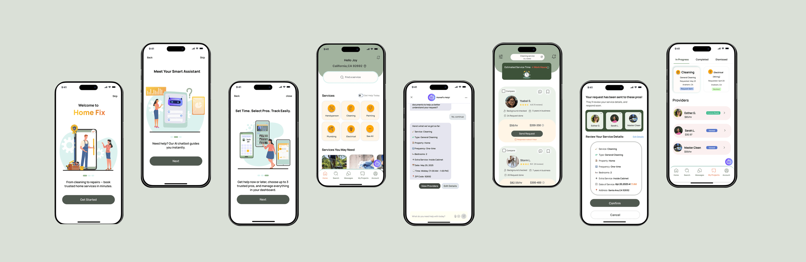
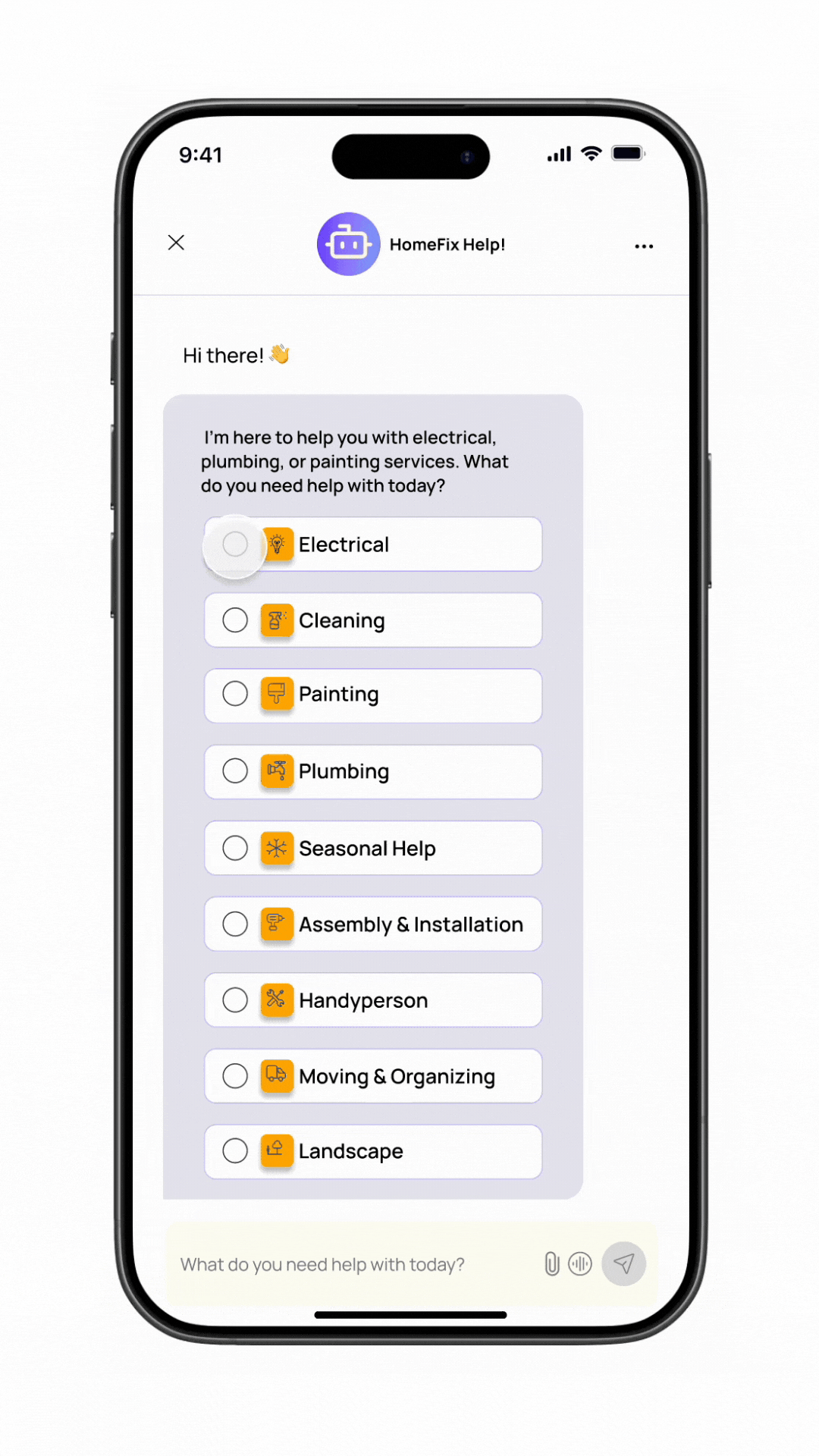
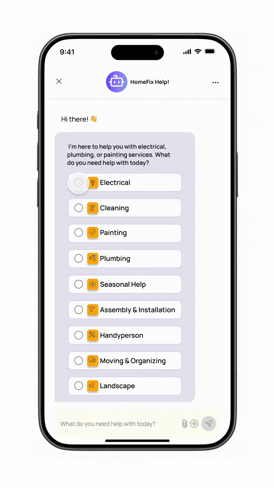
HomeFix is a home service platform that connects users with background-checked providers. It uses AI assistance to help describe projects and estimate cost and time, with a “Get Help Today” option for urgent service needs.
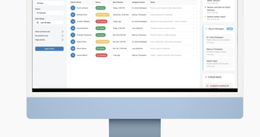
Our team was tasked with creating an easy-to-use, accessible platform focused on chatbot and the provider's cart.
Summary
Goals
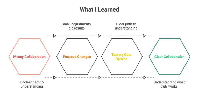
AI was new to this space, so we had to learn how users expected to interact with it and where it could actually help.
Show clear request details to reduce user–provider chats and keep payments on the platform.
Introduce AI in a few questionnaire questions, keeping the experience simple and user-friendly.
Constraints:
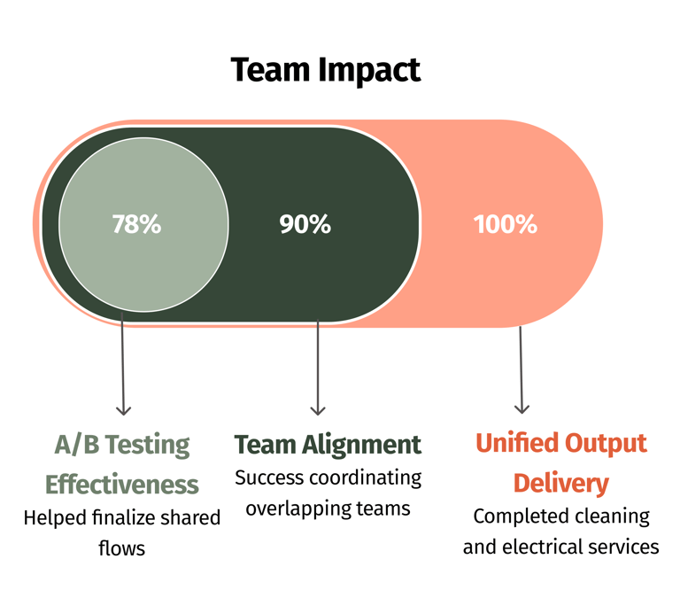
We were six teams working on different tasks for a home service app, with every two teams sharing a similar flow. We focused on electrical and cleaning services, and we had to deliver one final output. Despite challenges in aligning our work, through A/B testing, we were able to finalize the design.
Process
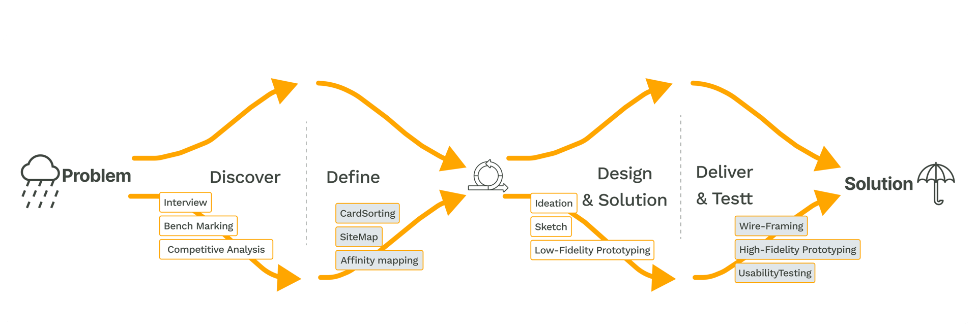
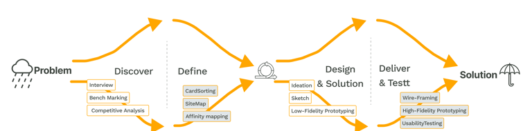
Discover
We ran competitive analysis and benchmarking to understand our users better and shape the design around their actual needs.
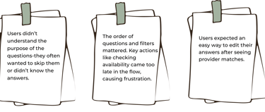
We conducted benchmarking sessions with four users who booked services on Angi and Thumbtack. We selected these platforms for their questionnaire approach, which gathers detailed information to provide better estimates and tailored options. By observing user interactions, we identified common behaviors and pain points in the booking process.
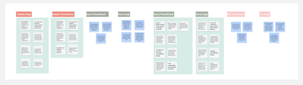
This is the outcome:
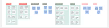
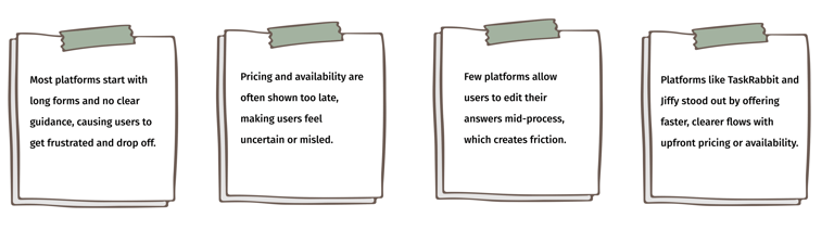
We did competitive analysis and looked closely at similar platforms to understand their features, how they work, and what’s missing in the market.
This is the outcome:

Competitive Analysis
Benchmarking
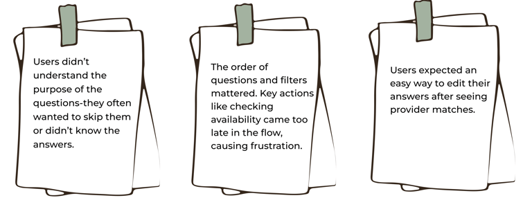
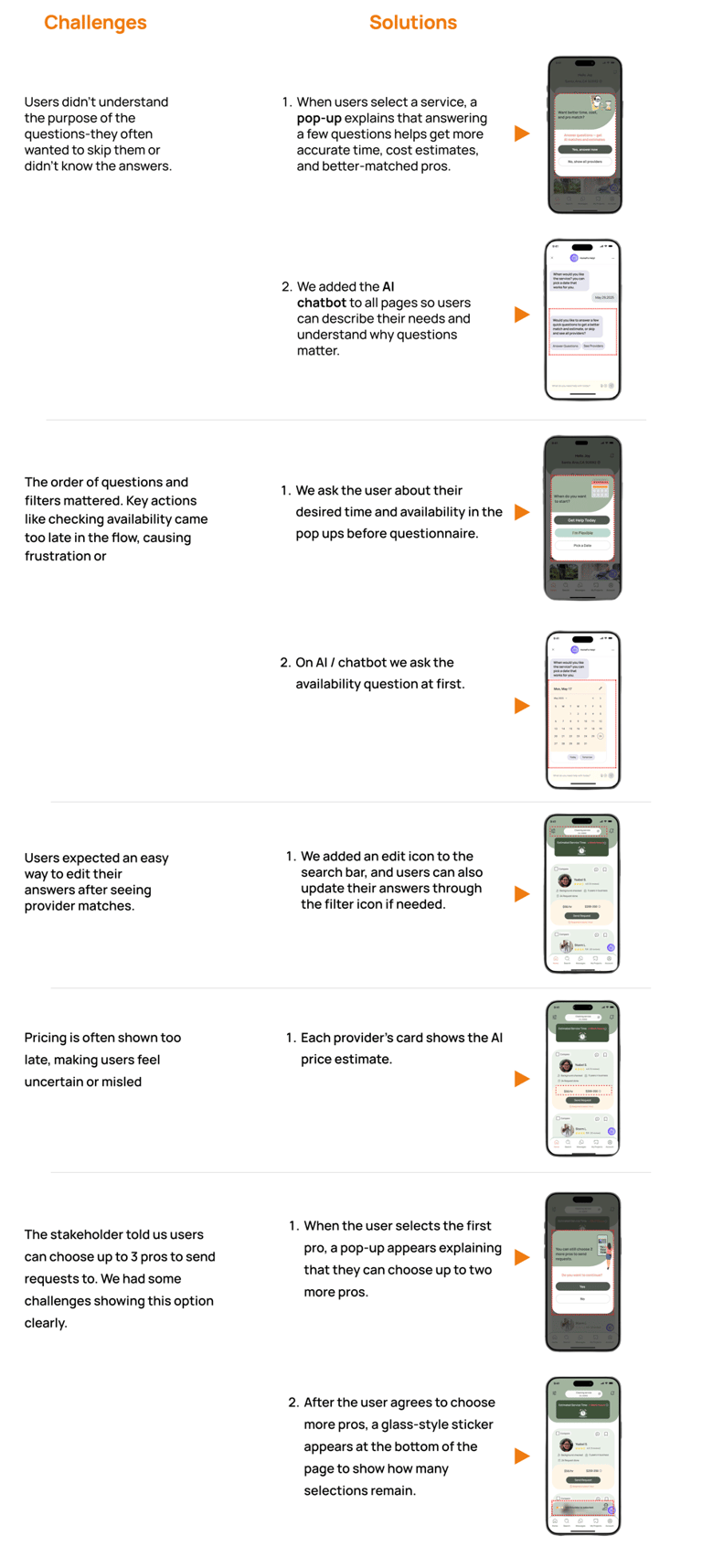
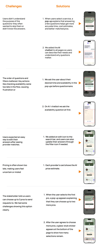
Challenges & Solutions
Define

Persona
Card Sorting
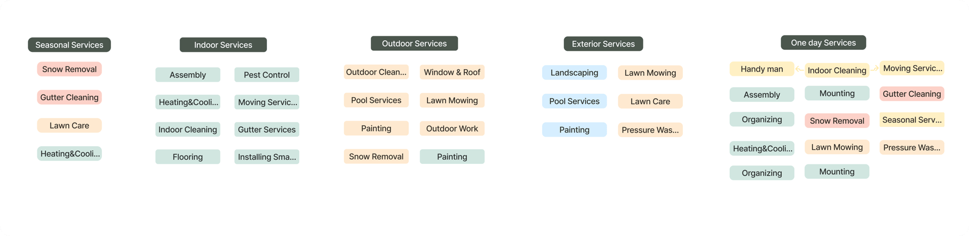
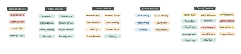
To improve website navigation and structure, we ran 5 remote open card sorting sessions with potential users and the stakeholders. The goal was to identify clear, effective labels and understand how users expect to browse home service content.
👇🏼Here’s a sample from one of the sessions.
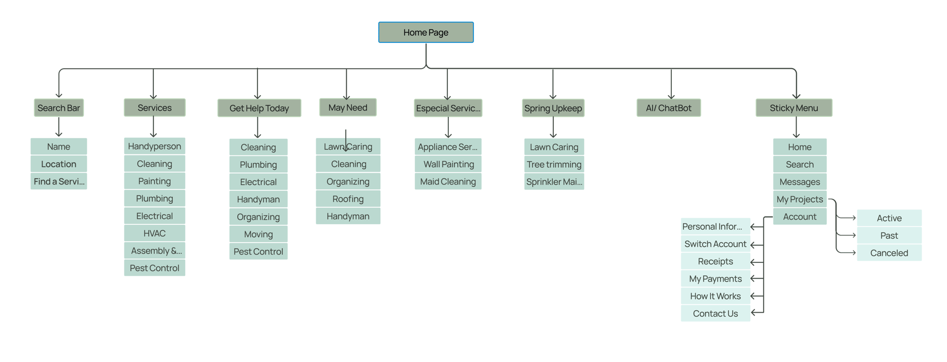
Site Map
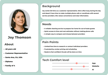
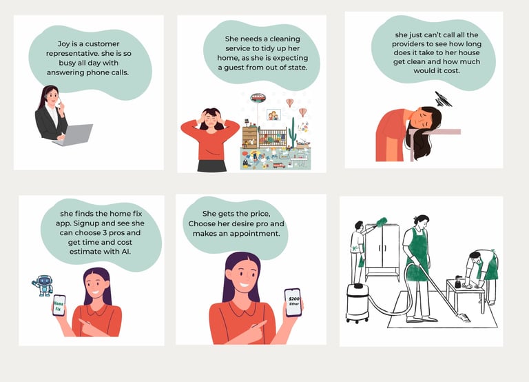
In order to establish tasks for our design, and to communicate information about the users that we collected during research, we developed a persona and a storyboard.
Storyboard
After completing the card sorting, we created our site map. It went through several iterations during the process, but we were eventually able to finalize the version shown below.
Design
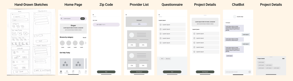
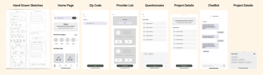
Sketches
At the Design stage, we started with sketches. First, we worked on the questionnaire, then designed the user flow through the chatbot. Below are some hand-drawn and low-fidelity sketches.
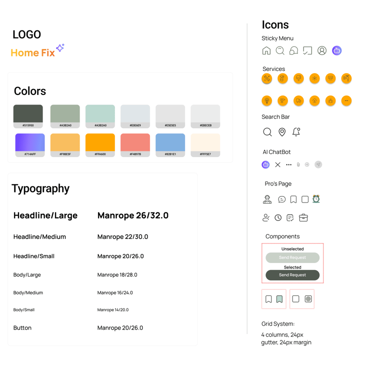
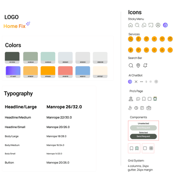
UI Kit
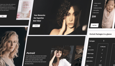
After we created sketches, we worked on our UI kit and mood board to keep our designs consistent. The mood board was inspired by themes of home services and AI chatbots.
Mood board


Deliver & Test
At the delivery stage, we went through many iterations to understand how users interact with different chatbot designs and questionnaire formats.
We conducted A/B testing on 2 different layouts.
(1) Push in
(2) Vertical
Phase 2:
Finding the Best Interface
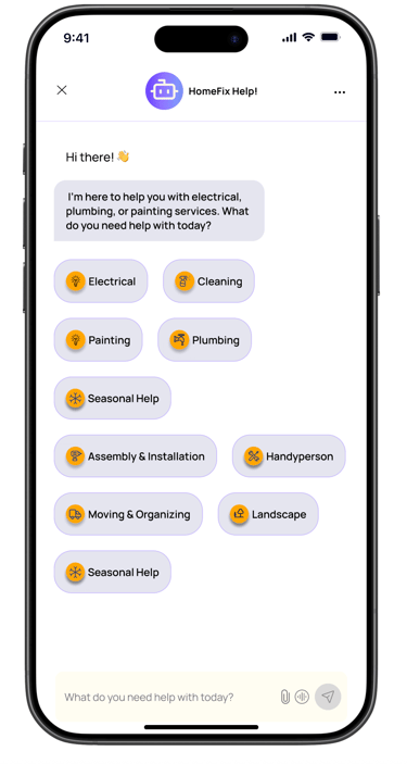
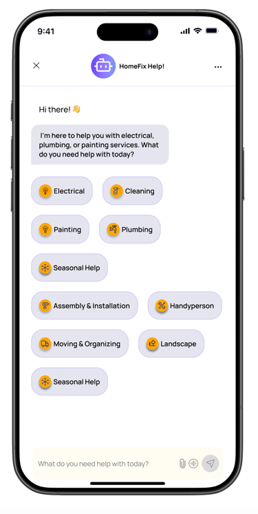
We created these two different chatbot layouts to explore the balance between space efficiency and usability.
The Grid Layout allows users to see all options at once without scrolling, which is ideal for quick selections.
Our users chose the grid layout!
Grid Layout
Vertical List
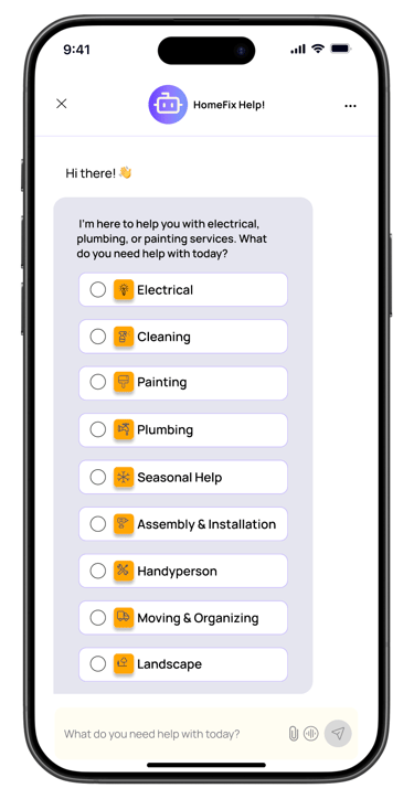
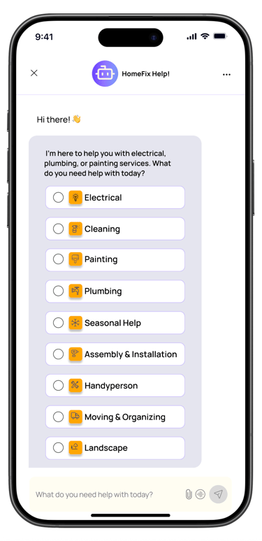
Phase 1:
Choosing the best layout for ChatBot AI
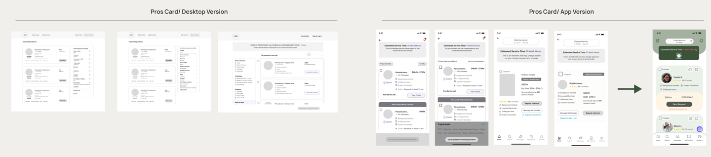
Providers Cart Iterations and Test
We did another round of testing for the provider's cart. To figure out what users liked when picking providers, we tried out a card sorting activity. We built on what the desktop team learned from their A/B testing.
After that, our team had a fun one-week design sprint where both desktop and app designers teamed up to nail down the final designs for each platform.
In the end, we wrapped up the final design for the app's provider cart.
Phase 3:
Usability Testing Summary
Tool: Maze
Test Type: Heatmap + Survey
Users: 6
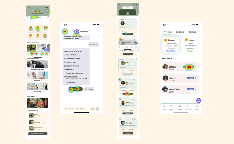
Key Heatmap Insights
Homepage: Most clicks on “Cleaning,” “Plumbing,” and “Painting.” Users ignored the Spring Upkeep section.
Chatbot Screen: High focus on “View Providers” → clear and compelling summary.
Provider Cards: Clicks centered on price, ratings, and profile photos—not on descriptions.
Project Page: Most clicks on current providers. Tabs like “Completed” were ignored.
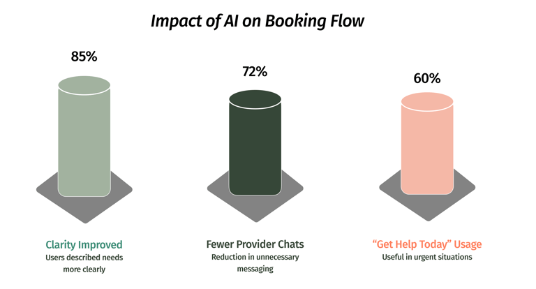
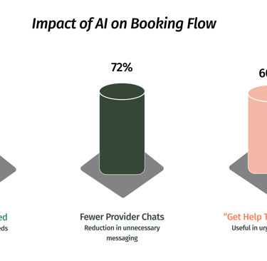
Usability & Flow Testing Outcomes
Survey Highlights
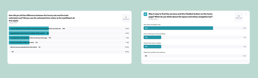
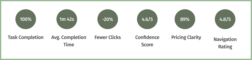
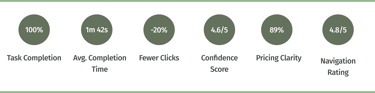
89% found hourly vs. task-based pricing easy to understand.
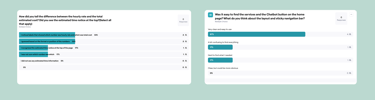
100% said services and chatbot were easy to find.
Navigation rating: 4.8/5
OutCome

Nina Khezri
UX/UI Designer
My projects